Table of Contents
ToggleChoosing the right paint color can feel like a high-stakes game of roulette. One wrong choice and suddenly that cozy living room looks like a circus tent. But fear not! With the right guidance, picking the perfect hue can be as delightful as finding a forgotten $20 bill in your pocket.
Overview of Paint Colors
Paint colors play a crucial role in defining the aesthetic of a space. Various shades influence mood, energy, and perception of size, making the selection process important. Neutrals, such as whites and grays, serve as versatile backdrops that enhance furnishings. Warm colors like reds and oranges create a cozy atmosphere, while cool colors including blues and greens evoke calmness.
Selecting the right finish also affects the overall look. Matte finishes absorb light and provide a subdued appearance, while glossy finishes enhance brightness and make colors pop. Each finish impacts the way colors interact with light, which can alter the perception of a room throughout the day.
Trends frequently shift, making it essential to stay updated with popular colors. As of 2023, earthy tones like terracotta and olive green dominate, reflecting a collective move toward nature-inspired palettes. Sustainability trends also influence choices, with many opting for paints made from eco-friendly ingredients.
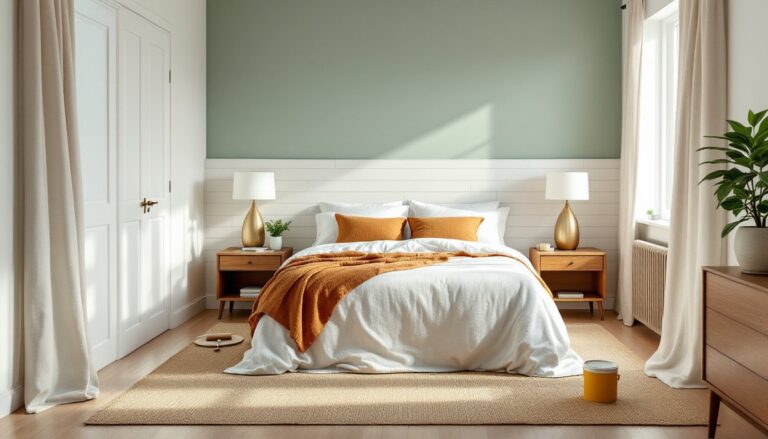
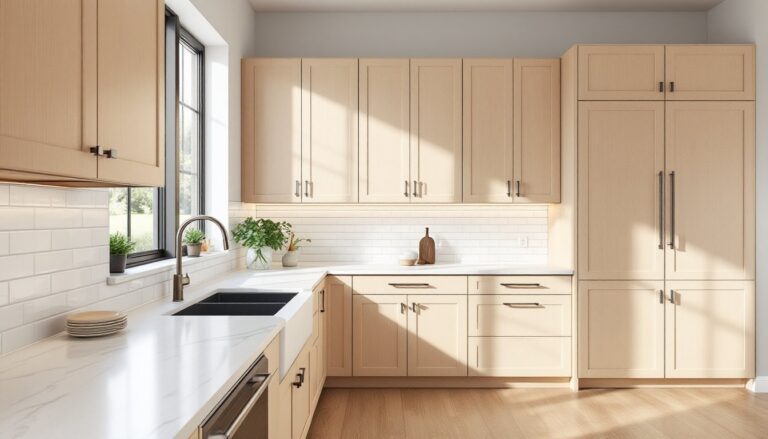
Considering the space’s function is vital when choosing colors. For instance, bedrooms benefit from softer, more calming hues, while kitchens often shine with brighter, energizing colors. Applying color theory aids in making intentional choices; complementary colors create contrast, while analogous colors promote harmony.
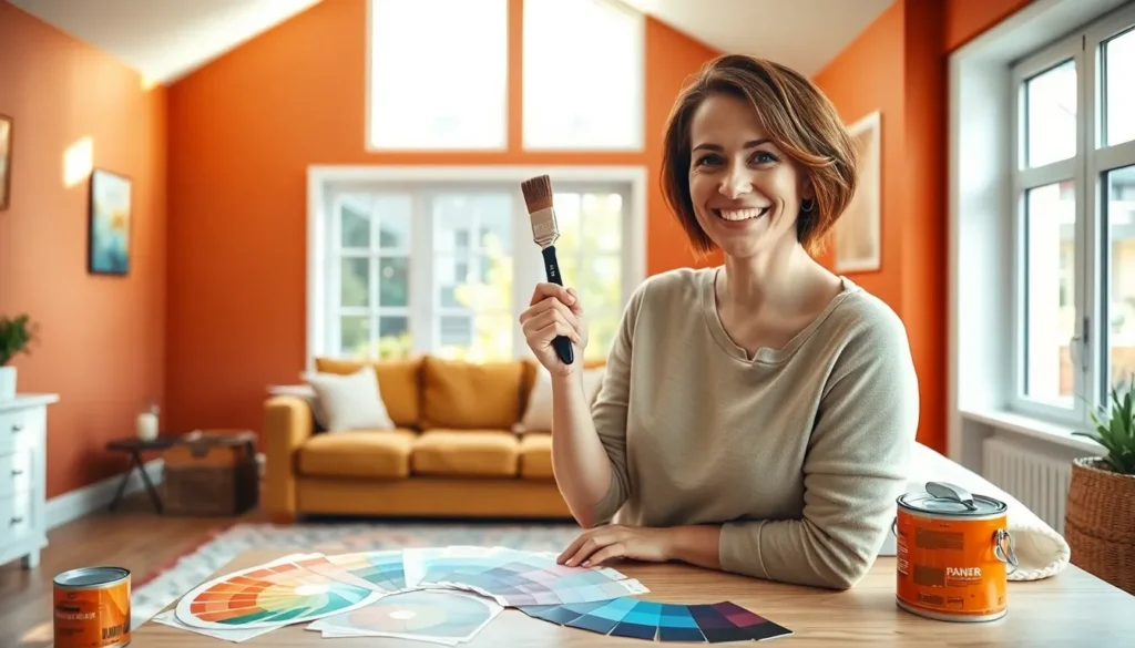
Additionally, testing samples in the intended environment is advisable. Lighting, furniture, and decor can significantly alter how colors appear. By sampling various colors on walls, individuals can visualize how they interact with their unique spaces.
Types of Paint Colors
Understanding various types of paint colors helps in making informed choices. Each color category serves a specific purpose in enhancing a space’s ambiance.
Primary Paint Colors
Primary paint colors consist of red, blue, and yellow. These colors form the foundation of all other hues. Artists and designers often use them for creating striking combinations. Mixing two primary colors results in vibrant secondary shades. Identifying the right primary color is essential for establishing a cohesive color scheme.
Secondary Paint Colors
Secondary paint colors include green, orange, and purple. These hues result from mixing equal parts of two primary colors. For instance, red and yellow create orange, while blue and yellow create green. Secondary colors add depth and interest to a room’s palette. Complementary contrasts can enhance these colors, making them stand out even more.
Tertiary Paint Colors
Tertiary paint colors arise from blending primary and secondary colors. An example includes red-orange and yellow-green. These hues bridge the gap between primary and secondary shades, creating more complex tones. Tertiary colors introduce subtlety and variation into designs. Utilizing these colors can foster a sophisticated aesthetic, enhancing overall visual appeal.
Choosing the Right Paint Colors
Selecting the ideal paint color involves considering various factors influencing a space’s atmosphere.
Considerations for Different Spaces
Room function heavily influences color choice. Bedrooms benefit from soft, calming hues that promote relaxation. Living areas thrive with warm, inviting tones that encourage social interaction. Kitchens often suit brighter colors, energizing the cooking environment. Factors like room size also matter; lighter shades can create an illusion of spaciousness, while darker tones add intimacy. Tailoring colors to the intended use enhances both functionality and aesthetics.
Effect of Light on Paint Colors
Light plays a critical role in how paint colors appear. Natural light can brighten shades, making them look vibrant, while artificial lighting alters tones, sometimes leading to unexpected outcomes. Consider the direction windows face; south-facing rooms receive warm light, enhancing warm colors, while north-facing spaces can appear cooler and more subdued. Illuminating paint samples in different lights reveals how colors interact with the environment throughout the day. Testing colors during various times ensures a better match with a room’s light source.
Trends in Paint Colors
Current trends in paint colors highlight a significant shift toward earthy tones, with a focus on nature-inspired palettes. Natural colors create a calming atmosphere and reflect a preference for eco-friendly options. Softer hues make for excellent choices in bedrooms, promoting tranquility, while brighter shades energize kitchens. Selecting colors based on the function of each space enhances overall design and mood.
Popular Color Palettes
Neutral colors dominate popular palettes, providing versatility and adaptability in various settings. Warm earth tones like terracotta and sandy beige are frequently chosen for creating inviting environments. Meanwhile, cool colors such as soft blues and greens establish serene spaces. Bold accent colors, including deep navy or rich burgundy, add drama and contrast when paired thoughtfully. Mixing these shades helps to generate dynamic and balanced aesthetics.
Timeless Color Choices
Timeless colors endure across trends, offering lasting appeal and elegance. Whites and creams serve as classic backdrops, allowing for flexibility in decor. Subtle grays continue to gain favor due to their ability to complement multiple styles. Additionally, muted jewel tones like emerald green or sapphire blue provide depth and sophistication. These color choices remain relevant, enhancing spaces and maintaining their charm over time.
Paint Colors and Mood
Paint colors significantly impact mood and ambiance in any space. Understanding how different shades influence emotions helps in making informed choices.
Psychological Effects of Colors
Colors evoke specific feelings and responses. Red stimulates energy and excitement, making it ideal for social spaces. Blue offers a calming effect, perfect for bedrooms or relaxation areas. Yellow brings warmth and cheerfulness, enhancing creativity in kitchens and workspaces. Green symbolizes nature and renewal, creating a refreshing atmosphere. Individuals often report increased relaxation in environments featuring soft, earthy tones. Darker shades like navy or charcoal can feel heavy but provide depth when used sparingly. Each color’s psychological effect plays a crucial role in defining how a room feels.
Color Combinations for Harmony
Creating harmonious color combinations is essential for a cohesive look. Neutrals pair well with both warm and cool colors, offering a versatile backdrop. Combining complementary colors like blue and orange can create vibrant energy. Analogous colors, such as blue and green, provide a seamless flow while maintaining visual interest. It’s important to balance bold hues with softer tones to prevent overwhelming the senses. Testing combinations using samples helps visualize how colors interact in real settings. Consistent use of color theory creates intentional spaces that resonate emotionally.
Choosing the right paint color can transform any space into a personal sanctuary. With a thoughtful approach to color selection and an understanding of its psychological effects, individuals can create environments that resonate with their desired moods and functions.
By embracing current trends and experimenting with different palettes, it’s possible to achieve a unique aesthetic that reflects personal style. Testing samples in various lighting conditions ensures the chosen colors harmonize beautifully with the room’s atmosphere.
Ultimately, the journey of selecting paint colors should be an enjoyable exploration of creativity and expression. With the right knowledge and a bit of experimentation, anyone can turn their vision into reality.